REBRAND
SafeLives
ABOUT THE CLIENT
SafeLives is a UK-wide charity dedicated to ending domestic abuse for everyone, for good. The organisation focuses on putting survivors at the heart of their work, supporting entire families, and challenging perpetrators.
THE PROJECT
To evolve the brand into a cohesive, highly adaptable identity. Key objectives included redesigning the logo lock up to improve balance and harmony with the strap line, while retaining the signature tick icon.
THE SOLUTION
Created a modern, cohesive badge-based logo designed to project trust, authority, and reliability. The shield-like emblem draws on traditional symbols of safety and recognition to evoke protection, empowerment, and solidarity.
To support the rollout, I designed
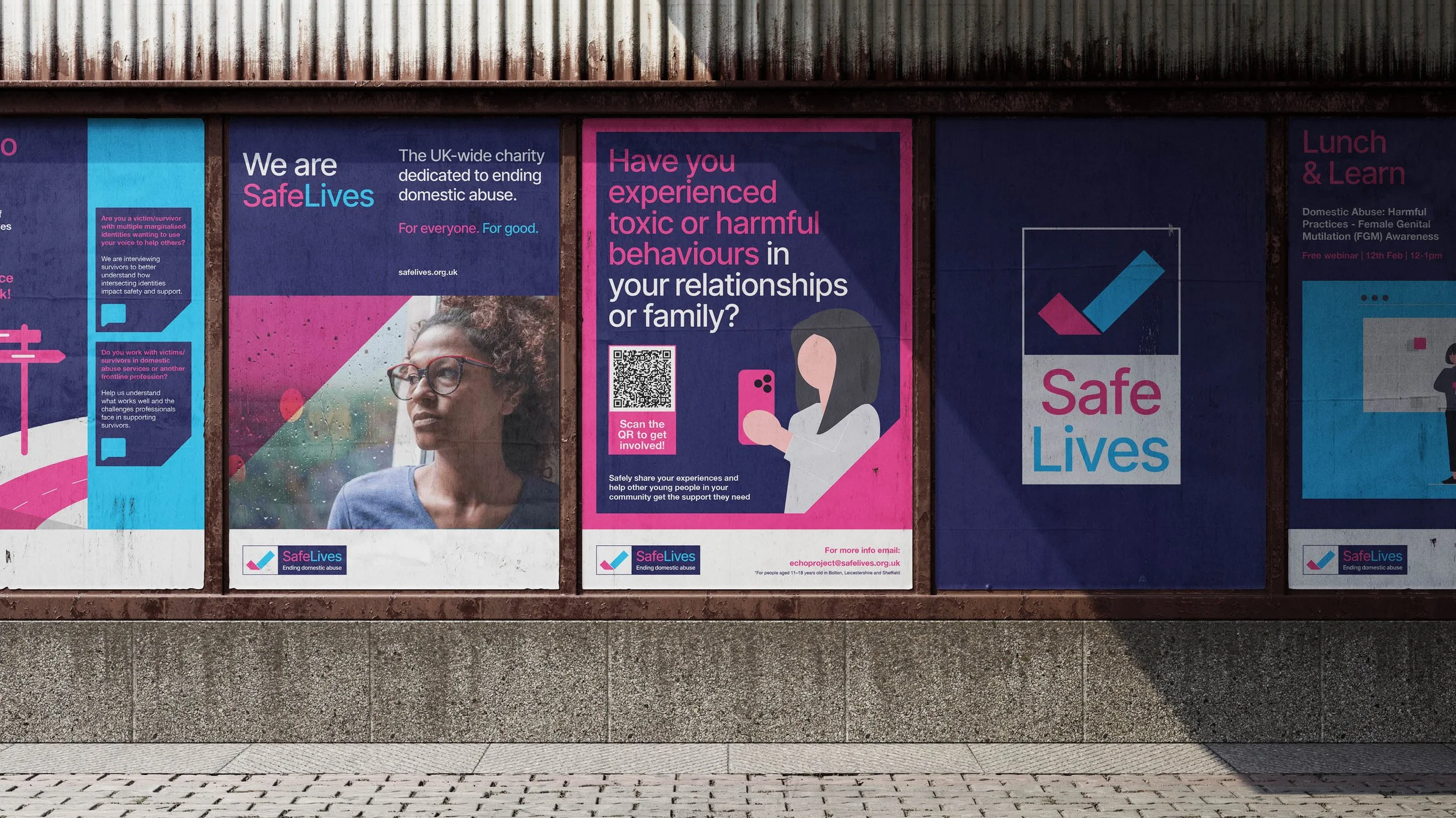
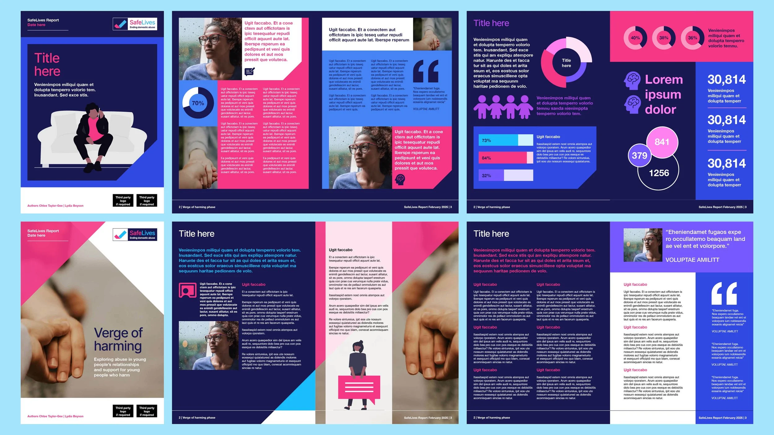
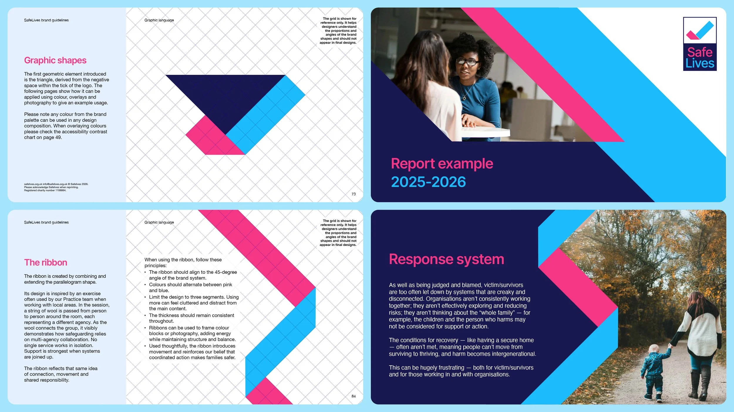
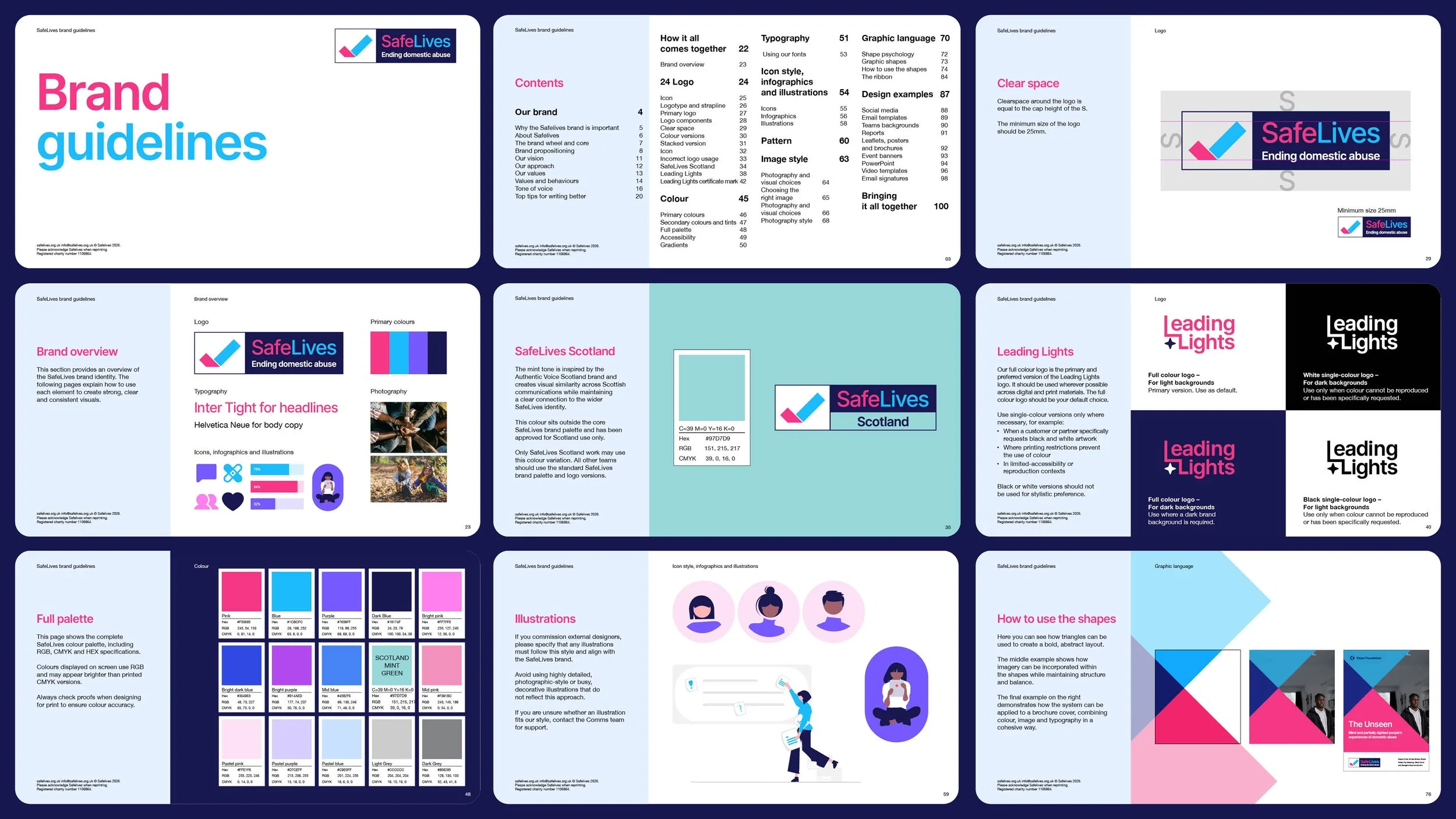
a comprehensive brand guidelines system with a versatile visual identity and intuitive templates for the in-house team. This included sub-brand logo designs and distinct color palettes for both SafeLives Scotland and Leading Lights, SafeLives’ accreditation program.
DELIVERABLES
Logo design
Full brand identity
Sub brand logos
Graphic language
Brand guideline
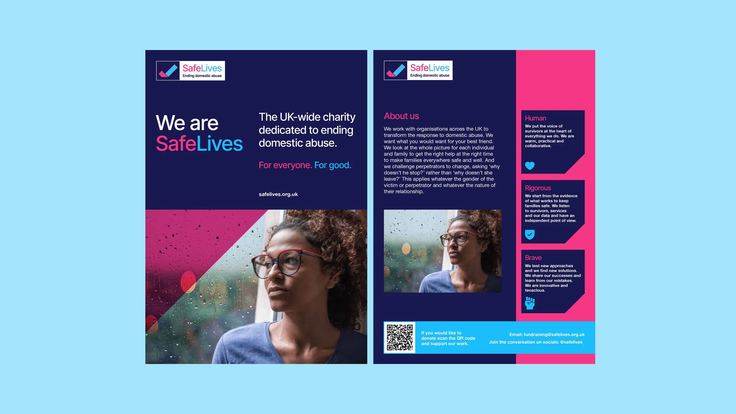
Print collateral
Design templates
Event graphics
Digital designs
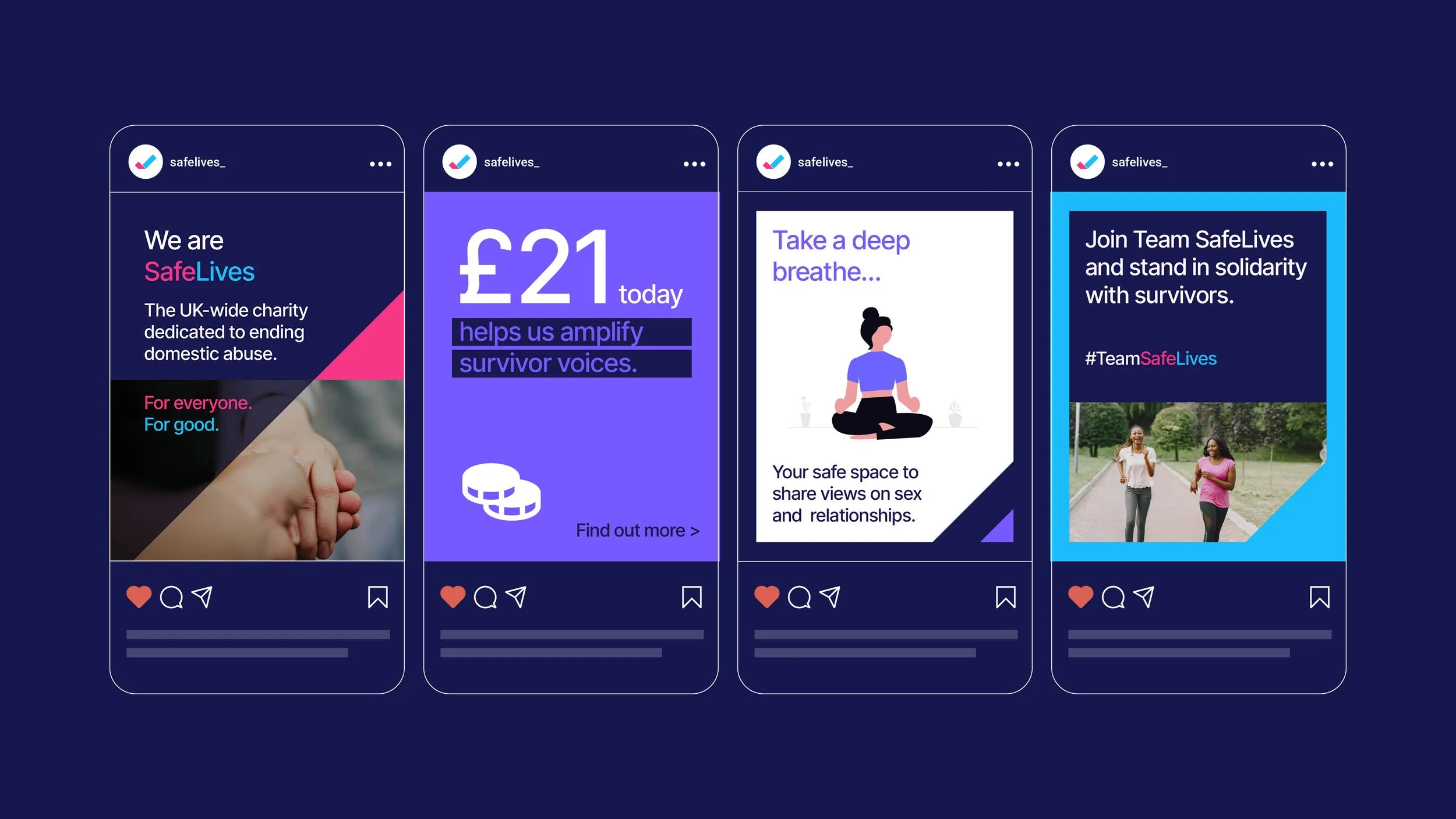
Social media
Email templates
Email signatures
Canva templates
Canva assets
Video graphics
Project management